In the last three years I have seen the local evolution of the
Modern Quilt Movement. At first it was very subtle and insidious at least at the show venue. In the shops I started seeing more bright colors, more white negative space, more solid fabrics. Some of the early prints seemed a little juvenile to me almost cartoonish like the 1970's Heaven forbid! But now those colors and prints seem more refined, more clearly executed in the printing.
 |
| This quilt is an example of the style I am seeing more and more. Large negative space, geometric designs. This photo doesn't show the quilt well, unfortunately. |
 |
| While not entirely 'modern' to me, this lovely geometric design has a significant amount of white space that sets the design blocks in direct contrast. A nice clean and lively presentation. |
 |
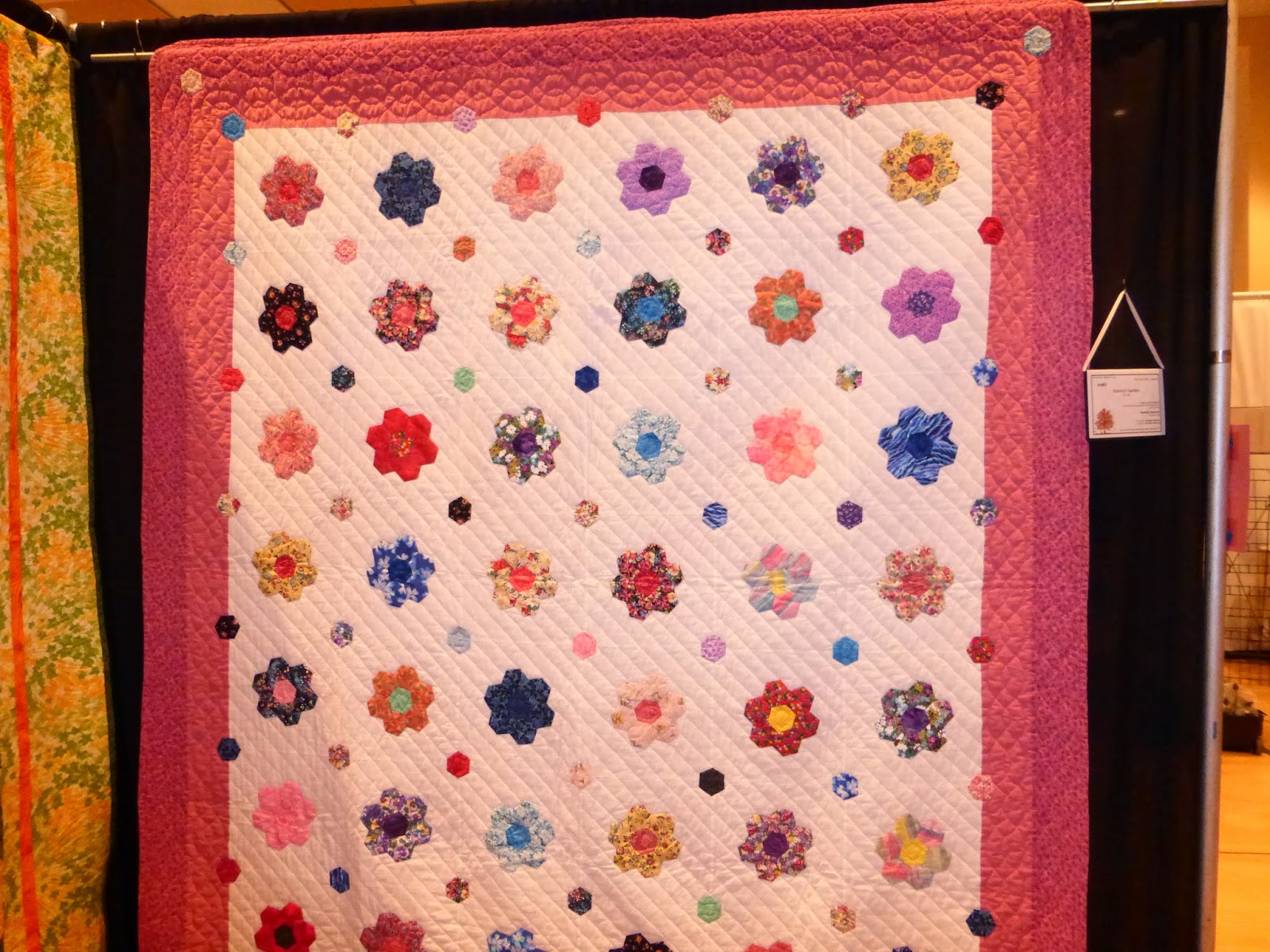
| A traditional patern executed in lively 'modern' colors. Beautiful. |
 |
| But make no mistake, beautiful traditional designs tend to dominate our show. This charming quilt caught my eye because the colors are so fresh but reminds me of a quilt that Husband's Grandmother had. I also like the straight line diagonal of the quilting. | | | | |
|
|
Please know that these are my observations and opinions, not the judges. I didn't even have time to read the judges comments. Next year I will make time. This quilt journey is a learning experience. I am attempting to learn by studying what I see. Until then, watch and learn says I.
***do you watch The Good Wife? Can you believe they killed off Will Gardener? Wow, that was a surprise! Apparently in the works for a long time, he only signed a four year contract. The interaction between him and Alicia drove the show for me, we will see where it goes now. Yeesh, another burst bubble!


Comments
That's true quilters' gastronomy, a banquet, isn't it?
Enjoy!
Cheers,
Jeanneke.